
Manifest Urban Arts Festival 2013
~
Client: Columbia College Chicago
Year: 2013
Columbia College Chicago’s annual end of the year urban arts festival, Manifest, is a student-powered event and features graduating students’ showcases, live musical performances, film screenings, gallery shows, lectures, readings, and various other activities.
Every year, a competition is held to find the next creative director and out of about 50 applicants, my initial designs won the public vote and I was chosen to brand Manifest.

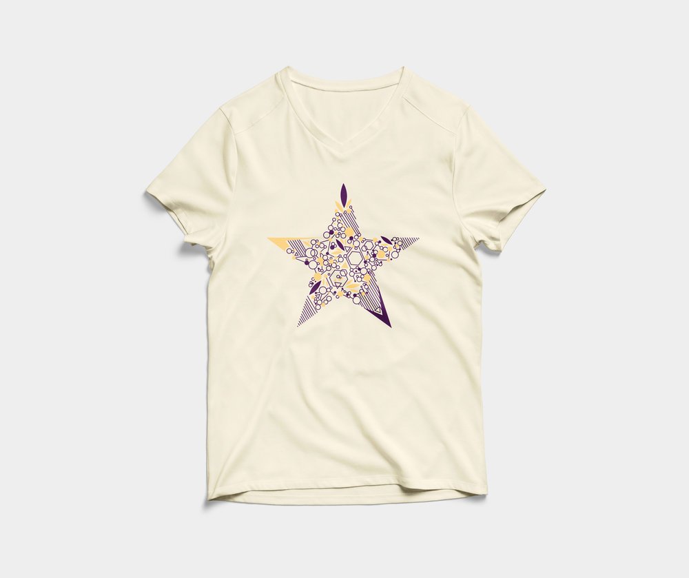
Manifest wordmark with a simpler star.
The concept for the campaign was a visualization of the word layers, and how many identities an individual may have. I drew inspiration from my personal identities as an immigrant, Vietnamese woman who was raised in Oklahoma City. Everyone I met at Columbia had such intricate identities, too, and I felt the best way to showcase this concept was to design a brand that utilized different mediums such as photography, illustration, iconography, and typography together in a dynamic and fun way.
The result is a colorful, customizable identity that allows you to create individual pieces that stand out on their own, and work perfectly together.


Logo with ornamental star in 3 different color schemes.
The typeface used for the word “MANIFEST,” Nilland, was chosen because of the dynamic directions of the letters’ serifs. Its bold weight and square tittle above the “i” lends itself to the star and sharp shapes in the pattern library. Quicksand, the second typeface, matched the more rounded shapes. A stroke star instead of a filled shape nods to the linework in the main patterned star.
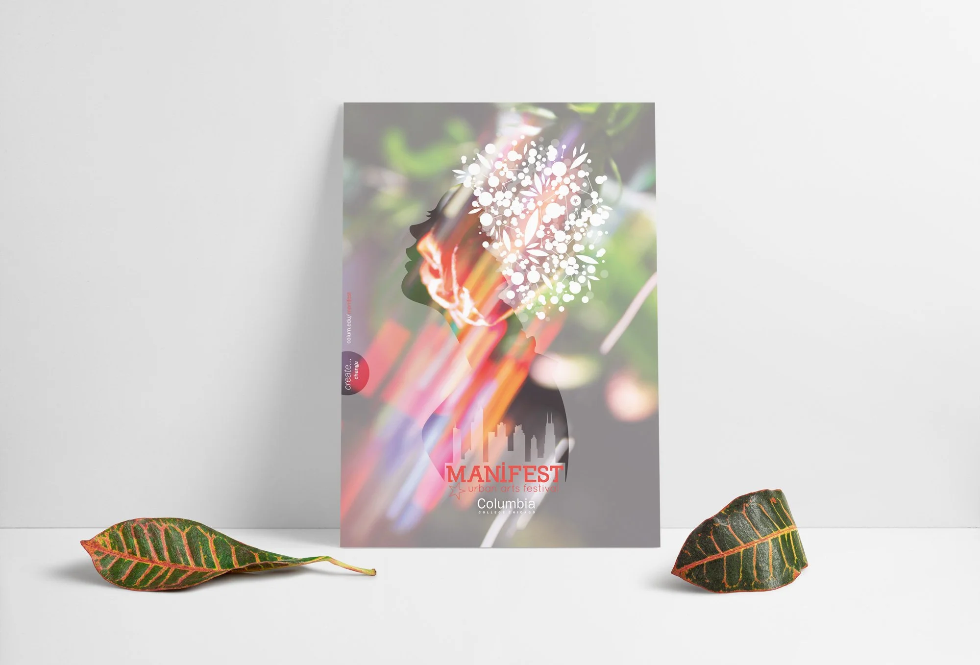
Official poster.


Save the date postcard (blue) and Alumni Celebration card (patterned).

Alumni Celebration card (left), Shop Columbia blank customizable card (center), Shop Columbia coloring card (right).

Buttons!
When Manifest was founded, the star was chosen as the symbol to represent all the wildly creative and talented students that graduate from Columbia. Instead of a solid shape, I set out to reimagine a star that utilized the constellation of solid and outlined shapes and linework.


Patterned banners for student organization booths.


Planter shapes.


Large billboard banners.

